Sharing with you all my recent Personal Project With Bold Color Food Photography.
Tomatillos In Analogous Colors- By Deepika. Haldankar. Image Specifics: ISO: 200, Aperture: f/10, Shutter Speed: 1/4 sec.
Hello and Welcome to my first blog post. I intend to post things that I learn and behind the scenes of my work in this section.
Today I am sharing my recent Personal Project with Bold Color Food. Let’s begin.
How Did I Come Up With This Idea?
I have been photographing food for quite some time. It was usually a norm when I started photographing food to always use a non glossy backdrop and no bright or bold colors. They distract from the main subject.
I followed these norms till now. Then, as I was doing some research for Product Photography, I came across some images which got me thinking. How about using the unconventional backdrops and photographing food on it.
I started with buying Vinyl Sheets. I picked the glossy ones. Since I was going for my envisioned look.
I stuck them on the canvas paper, and while sticking I made sure it was not smooth. This gave an effect of added layer and texture to the vinyl sheets.
Then Came The Challenges
There were three major challenges, that I faced when I first started to photograph food.
Glare on the glossy background.
Color of the overall image.
Sharpness.
Overcoming The Challenges
Initially, the day was full of trial and errors. Finally, I rounded up to three main points.
For Glare on glossy backdrop- I went with backlight, and kept the subject away from the window. (I will explain this in a bit)
For Color- Brushed my editing techniques, focusing more on Hue. Along with Color Theory.
For Sharp Images- Tripod and Camera Remote- No touching the tripod at all after it is set for the shot.
Red Cherries- Backlight With Complementary Colors- By Deepika Haldankar. Image Specifics- ISO-200, Aperture: f/11, Shutter Speed: 0.6 secs.
Let’s Talk About The Learnings
Backlight:
For this project, I have used backlight for all the images. There are few reasons.
Backlight gives a dramatic effect on the subject. The light coming from the back casts amazing shadows to the front.
Placing your set up away from the window (light source) on the floor, made the light less reflective, since its power reduced considerably. ( More about this at Rachel Korinek- Art Of Light Course, I have learned so much from this course. Art Of Light has taught me how to manipulate Light in the best possible way. )
Since the light is reduced, I kept the Shutter Speed at the lower side to get in as much light as I can. Using a tripod at this point was a must.
Color Theory:
A good grip of Color Theory. I used Complementary, Monochromatic and Analogous Colors as well. Deciding which color will go well with a particular food to enhance it, is important.
Editing:
Editing played a major role in this project. Due to the low light, the images came out quite dark. To bring out their real beauty, editing their color in terms of brightness and highlights was important. Along with cropping. My main focus was on the Hue. Below are the examples of Before And After Hue Adjustment.
After the Hue adjustment, the image below was the result.
Raw Shrimp- By Deepika Haldankar- After Hue Adjustment. Image Specifics: ISO: 200, Aperture: f/10, Shutter Speed- 0.8 sec.
A little tweak in Hue creates a dramatic effect. Isn’t it?
I throughly enjoyed doing this Personal Project. Sharing some more images from this project.
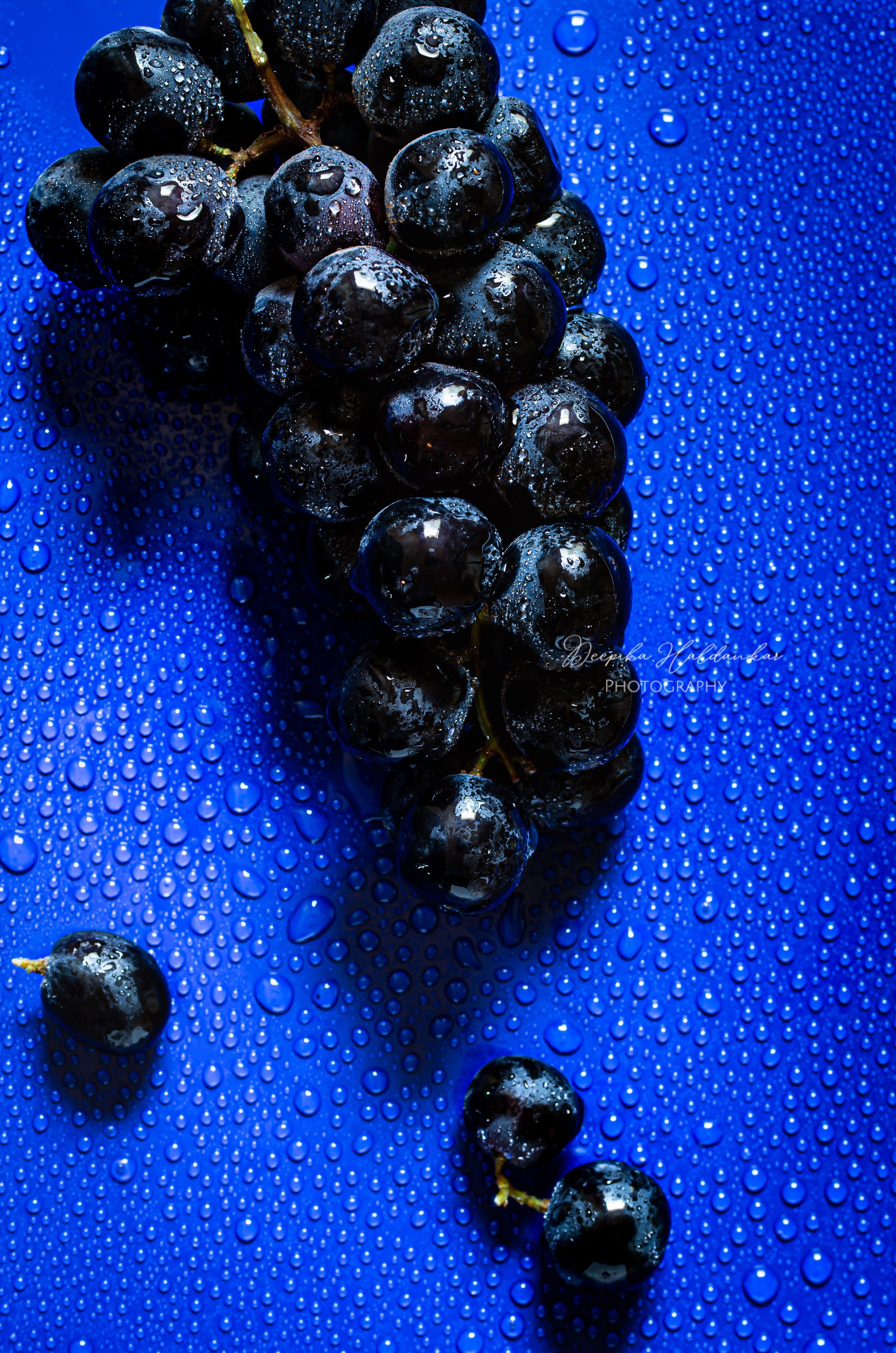
Black Grapes- By Deepika Haldankar. Image Specifics- ISO- 200, Aperture: f/9.0, Shutter Speed: 1.6 sec.
Green Onions- By Deepika Haldankar- Image Specifics: ISO: 200, Aperture: f/11, Shutter Speed: 0.4 secs
Green Mint- By Deepika Haldankar- Image Specifics: ISO: 200, Aperture: f/13, Shutter Speed: 1.0 sec.
#BOLDCOLORFOOD
Since I started this project, I have shared the images on my Instagram under the #BoldColorFood hashtag. I have been joined by many other creatives on this adventure. If you are into working with Bold Color backdrops and foods, I invite you join in this hashtag with me.
If you decide to post your work on instagram, use the hashtag- #BoldColorFood and tag @deepika.haldankar. This way I will be able to see your work as well.
It is so much fun sharing my work with you all today. I will catch up with you all soon again with a new project.
Till then, take care and have a great day ahead. :)


